Chapter 3 geom_timeline
The geom_timeline is a new geom_* of ggplot2 package that aims to enhance the visualization of earthquake. This Geom has some configuration:
- size: The earthquakes as displayed as circles with different radius (according to the
EQ_PRIMARY); - color: This is based on the
TOTAL_DEATHS; - x axis: This is the temporal axis.
- y axis: Each county has your own line, it is not possible to mix countries in a single y axis.
3.1 Example 1
Let’s plot the earthquake from 1000 to 2000, which occured in JAPAN.
# Path to the raw data.
raw_data_path <- system.file("extdata", "signif.txt", package = "msdr")

# Loading the dataset of Earthquake.
df <- readr::read_delim(file = raw_data_path,
                        delim = '\t',
                        col_names = TRUE,
                        progress = FALSE,
                        col_types = readr::cols())

# Cleaning the data and filtering.
df %>%
       eq_clean_data() %>%

              filter(COUNTRY %in% 'JAPAN',
                     YEAR >= 1000 &
                     YEAR <= 2000) %>%
              # Creating a ggplot object
              ggplot() +
                     # Using the new Geom
                     geom_timeline(aes(x     = DATE,
                                       y     = COUNTRY,
                                       size  = EQ_PRIMARY,
                                       color = TOTAL_DEATHS)) +
                            # Adding theme.
                            theme_msdr() +
                                   # Editing the legends' titles
                                   labs(size = "Richter scale value",
                                        color = "# deaths")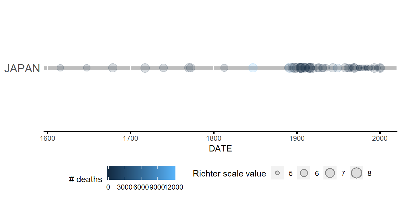
Most of earthquake records in Japan are concentrated between 1900 and 2000.
3.2 Example 2
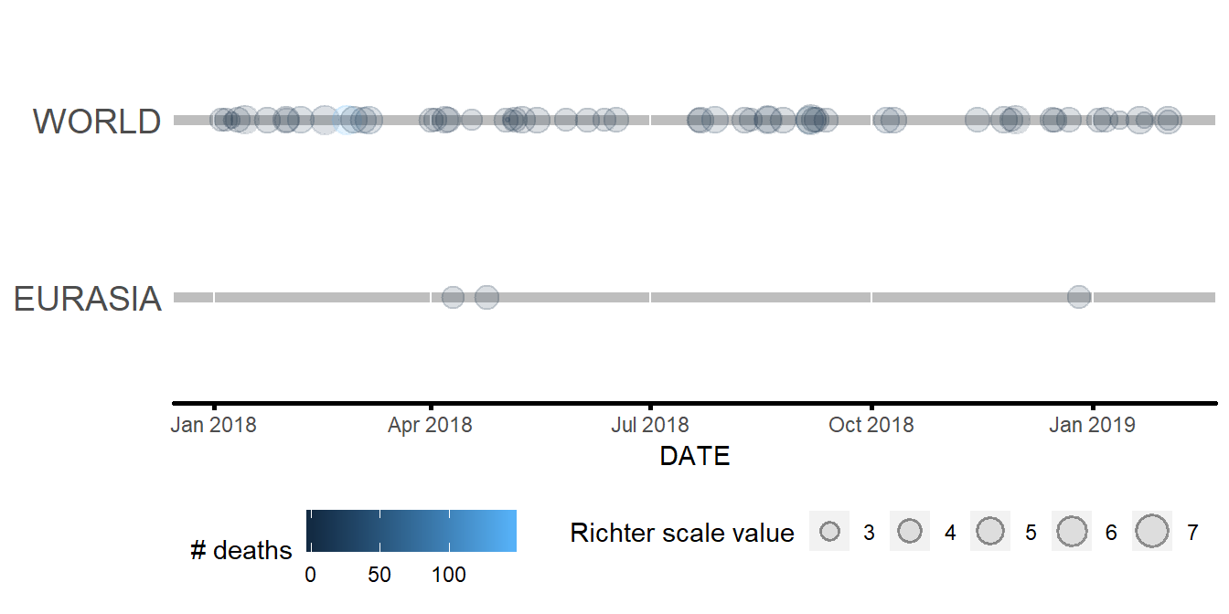
The earthquake record of 2018. Simple comparison.
# List of countries in Europe and "West Asia". This is not an exhaustive list.
eurasia <- c('SPAIN','GREECE','TURKEY','PORTUGAL','RUSSIA','FRANCE','MACEDONIA','BULGARIA',
             'ALBANIA','GEORGIA','ITALY','SLOVENIA','UK','CYPRUS','UKRAINE','CROATIA','AUSTRIA')

# Cleaninig data and filtering.
df %>%
       eq_clean_data() %>%
              # Creating a new feature.
              mutate(CONTINENT = case_when(COUNTRY %in% eurasia ~ "EURASIA",
                                          !(COUNTRY %in% eurasia) ~ "WORLD")) %>%
                     # Filtering.
                     filter(YEAR >= 2018 &
                            YEAR <= 2019) %>%

                            # Creating a ggplot object
                            ggplot() +
                                   # Using the new Geom
                                   geom_timeline(aes(x     = DATE,
                                                     y     = CONTINENT,
                                                     size  = EQ_PRIMARY,
                                                     color = TOTAL_DEATHS)) +
                                          # Adding theme.
                                          theme_msdr() +
                                                 # Editing the legends' titles
                                                 labs(size = "Richter scale value",
                                                      color = "# deaths")